10-Step Mobile SEO Checklist to Optimize Your Site in 2026

Thanks for reading! I hope you enjoyed reading and learning more about digital marketing, SEO, and how to increase your visibility online.
Author: Patrick Michaels | Lead Content Strategist at Search Miners
A mobile SEO checklist is a short list of steps that make your website fast, easy to use, and easy to find on a phone. You fix things like page speed, mobile-friendly design, Core Web Vitals, and technical SEO. Do them well, and Google ranks you higher, so more customers find your business.
Most business websites still load slowly on phones, have tiny text, and feel clumsy to tap. Google now relies on mobile-first indexing, meaning it evaluates the mobile version of your website as the primary source for determining search rankings rather than the desktop version.
More than half of all web traffic comes from phones, so a weak mobile experience quietly costs you rankings, clicks, and sales every single day.
Search Miners, a Las Vegas SEO company, fixes mobile SEO, mobile page speed, Core Web Vitals, and technical SEO, and we use semantic SEO and GEO to grow your mobile search visibility.
What Is Mobile SEO?
Mobile SEO is the work you do to make your website rank well and feel good on phones and tablets.
It covers speed, design, content, and the technical setup that helps Google read your pages on small screens.
Traditional SEO often focused on big desktop screens. Mobile SEO puts the phone first, so you think about thumb-friendly buttons, fast loading on cell networks, short readable text, and a layout that fits any screen size.

Is Your Website Ready for the AI Search Era?
Traditional SEO isn’t enough anymore. ChatGPT, Gemini, and AI Overview are changing how customers find businesses. Our GEO and semantic optimization strategies ensure you’re visible everywhere your customers are searching.
Stay ahead of the competition with cutting-edge optimization.
4 Reasons Mobile SEO is Important for Rankings in 2026
Your rankings now live and die on the phone.
Google looks at your mobile site first, and so do your customers, so a strong mobile experience is the difference between showing up on page one and getting lost.
1- Google Uses Mobile-First Indexing
Google crawls and ranks your site using the mobile version.
If your mobile pages are slow, broken, or missing content, your rankings drop even for people searching on a desktop.
For example, a dentist hid half his service details on mobile to “clean up” the design, and Google ranked him for less because it only reads what the phone version shows.
2- Mobile Experience Impacts User Behavior
People on phones decide fast. A clear, quick page keeps them reading. A messy one sends them back to the search results in seconds.
Think of someone searching “pizza near me” while driving. If your menu loads in a blink, they order. If it stalls, they tap the next pizza shop without a second thought.
3- Faster Mobile Sites Improve Conversions
Speed and sales are linked. When a page loads in about one second, more people stay and buy. When it crawls, they leave before they ever see your offer.
A small online store we worked with trimmed its load time from six seconds to two, and more visitors finished checkout simply because they stopped giving up halfway.
4- Poor Mobile UX Increases Bounce Rates
As load time grows from one second to three seconds, the chance someone bounces jumps by 32%.
A bad mobile experience is one of the fastest ways to lose a sale you almost had. Picture a contractor whose quote form was too cramped to tap on a phone.
People started it, fumbled the tiny fields, and quit, so good leads bounced before he ever saw them.
The Ultimate Mobile SEO Checklist for Better Rankings
This is the core of the guide. Work through it in order, because each step builds on the one before it.
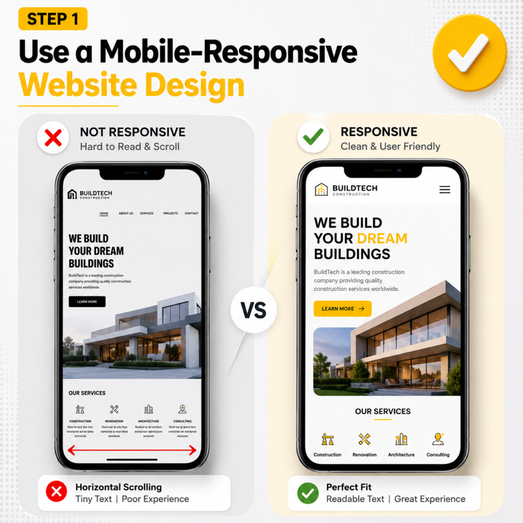
1- Use a Mobile-Responsive Website Design
Responsive web design is the base that everything else sits on. With a responsive layout, you run one website that reshapes itself to fit any screen, from a 6-inch phone to a wide desktop monitor.
You set this up with a flexible grid, CSS media queries, and the viewport meta tag, so text, images, and buttons resize on their own, which is the approach Google recommends for mobile.
Skip separate mobile URLs like m.yoursite.com. A split setup doubles your work, splits your link signals, and creates redirect and canonical headaches that Google’s mobile-first indexing does not like. One site, one set of pages, one clean structure.
A law firm in Las Vegas ran a desktop site plus an old “m.” version that was missing half its practice-area pages. Google indexed the thin mobile version, so the firm ranked for almost nothing on phones.
Moving to a single responsive site, with the full content showing everywhere, brought those pages back into the rankings within a month.
2- Improve Mobile Page Speed
Page speed is the foundation of mobile SEO, and it directly feeds your Core Web Vitals, especially Largest Contentful Paint (LCP).
On a cell connection, every extra second costs you visitors. Your goal is a fast first paint, a quick Time to First Byte (TTFB), and a page that feels instant in the hand. Here is how to get there.
Compress Images
Heavy images are the number one reason mobile pages feel slow, and they wreck your LCP. Compress every image and resize it to the size it actually displays at.
A 4000-pixel hero photo squeezed into a 400-pixel phone slot is wasted weight.
Using image optimization tools such as Squoosh or automated compression during the build process can reduce image file sizes by 60-80% while maintaining virtually the same visual quality.
Reduce Unused JavaScript
Heavy JavaScript blocks the main thread, freezes the screen, and drags down your Interaction to Next Paint.
Audit your scripts, remove plugins you no longer use, and defer or lazy-load anything that is not needed for the first view.
A typical small-business site loads three or four tracking and chat scripts it forgot about. Cutting them often shaves a full second off load time.
Use Browser Caching
Browser caching tells a phone to store your logo, fonts, and CSS so a returning visitor loads them from memory instead of downloading them again.
Set sensible cache headers, and your repeat visits feel almost instant.
This is a one-time server setting that pays off on every return trip.
Minimize Render-Blocking Resources
Render-blocking files are CSS and JavaScript that stop the page from showing until they finish loading.
Inline your critical CSS, defer the rest, and minify your code to strip out spaces and comments.
Fewer blockers mean your content paints sooner, which lifts both LCP and the way the page feels.
Use Fast Hosting and CDN
Slow hosting puts a ceiling on everything else you do.
Pick fast, modern hosting and add a CDN (content delivery network) that stores copies of your site on servers around the world, so a visitor loads from the location closest to them.
A coffee shop in Las Vegas compressed its menu photos, switched to a CDN, and trimmed mobile load time from five seconds to under two.
Its local rankings climbed within weeks, and online orders went up because people stopped bailing before the menu loaded.
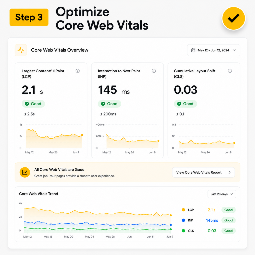
3- Improve/Optimize Core Web Vitals for Mobile
Core Web Vitals are key performance metrics that Google uses to evaluate the real-world experience of visitors on your website.
Unlike synthetic tests, these measurements come from actual user interactions and contribute to Google’s page experience ranking signals.
Websites that perform well across all Core Web Vitals often have a competitive advantage in search results.
Largest Contentful Paint (LCP)
LCP tracks the time it takes for the largest visible piece of content, such as a hero image, banner, or main heading, to load on the screen.
For the best user experience, keep LCP at 2.5 seconds or less.
Slow LCP scores are commonly caused by oversized images, poor image optimization, or delayed server responses.
Interaction to Next Paint (INP)
INP measures how quickly your page responds when someone taps a button, opens a menu, or fills a field.
Aim for 200 milliseconds or less.
INP replaced the old First Input Delay (FID) metric in March 2024, so make sure your tools track it.
Trimming heavy JavaScript is the fastest way to improve this score.
Cumulative Layout Shift (CLS)
CLS measures how much your page jumps around while it loads. Keep it at 0.1 or less.
The classic problem is a button that shifts down right as someone taps it, so they hit an ad by mistake.
Set the width and height on images and reserve space for ads and embeds to stop the jump.
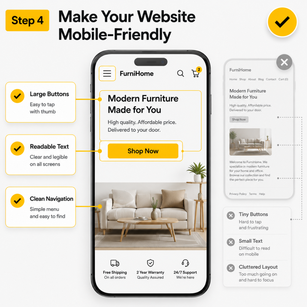
4- Make Your Website Mobile-Friendly
A mobile-friendly site feels easy in the hand and passes Google’s mobile usability checks. These four fixes cover most of what trips businesses up.
Readable Font Sizes
Use a body font size of about 16 pixels so people can read without pinching or zooming.
Small text is one of the most common mobile usability errors Google flags. If readers have to squint, they leave.
Proper Button Spacing
Make your tap targets big and well spaced, at least around 48 pixels, so a thumb hits the right link every time.
Crowded links lead to misclicks and frustration. A restaurant that spaced out its “Order” and “Reserve” buttons saw fewer abandoned taps almost overnight.
Avoid Intrusive Pop-Ups
Skip intrusive interstitials, the pop-ups that cover the whole screen the moment someone lands.
Google can demote pages that use them on mobile, and visitors bounce in frustration. If you must collect emails, use a small banner that does not block the content.
Easy Navigation Menus
Keep your navigation short, clear, and built around what customers actually want.
A simple hamburger menu with five or six clear links beats a sprawling mega-menu on a phone. People should reach any key page in one or two taps.
5- Optimize Content for Mobile Readers
Write for the small screen so people stay, read, and act. Mobile readers scan more than they read, so structure matters as much as the words.
Short Paragraphs
Use paragraphs of two or three sentences. Long blocks look like a wall on a phone and push people away before they start.
Clear Headings
Add clear, descriptive headings so readers can scan and jump to the part they want. Good headings also help Google understand your page and can win you featured snippets.
Scannable Formatting
Break content up with the occasional short list, bold line, or pull quote where it truly helps. The goal is a page someone can skim in five seconds and still get the point.
Mobile-Friendly CTAs
Make your calls to action big, clear, and easy to tap with a thumb. “Book an SEO Audit” as a full-width button beats a tiny text link buried in a paragraph.
Avoid Large Text Blocks
Skip giant walls of text. Trim, add white space, and let the page breathe. A cleaner layout keeps people reading and lowers your bounce rate.
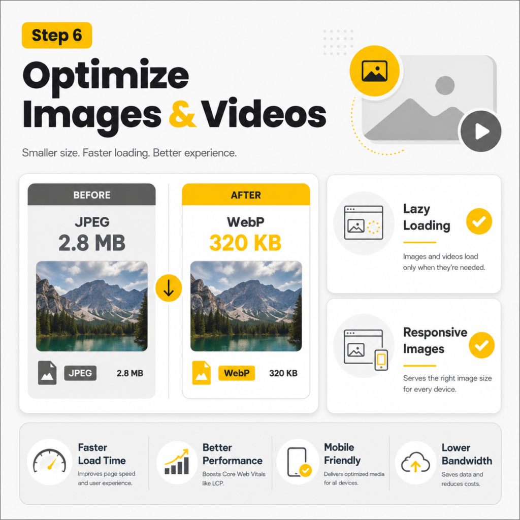
6- Optimize Images and Videos for Mobile Devices
Media is the heaviest thing on most pages, so handle it with care on phones. Done right, images and video make a page richer without slowing it down.
Use Modern Image Formats
Adopt modern image formats such as WebP or AVIF to improve website performance.
These formats deliver image quality comparable to JPEG and PNG and need less storage space.
Smaller image files load faster, helping reduce Largest Contentful Paint (LCP) times and enhancing overall mobile page speed.
Lazy Loading
Turn on lazy loading so images and videos load only as people scroll to them. The top of the page loads fast, and the rest fills in as needed. This is a simple attribute on modern sites and a big speed win on long pages.
Responsive Images
Serve responsive images that match the screen, using srcset so a phone gets a small file and a desktop gets a large one.
Nobody should download a 2000-pixel image to view it on a 5-inch screen.
Mobile Video Optimization
Make videos mobile-ready, so they play smoothly and never sit there unplayable. Host or embed them properly, add a lightweight poster image, and avoid autoplay that eats data.
A gym that swapped a heavy background video for a still poster cut its mobile load time in half.
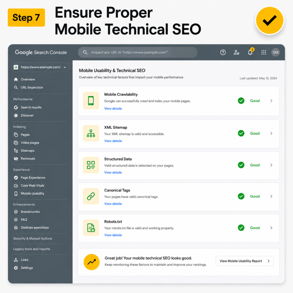
7- Ensure Proper Mobile Technical SEO
Technical SEO is the plumbing behind your site. Get it right, and Google can crawl, render, and index your mobile pages cleanly. Get it wrong and even great content stays invisible.
Mobile Crawlability
Confirm Googlebot can crawl and render your mobile pages and that nothing important is blocked.
Use the URL Inspection tool in Google Search Console to see your page exactly as Google sees it. Protecting your crawl budget keeps your best pages getting found.
Robots.txt Review
Check your robots.txt file so you are not blocking CSS, JavaScript, or whole sections by accident.
A single stray “disallow” line can hide pages you want ranking.
Structured Data Validation
Add and validate structured data (schema markup), the code that helps Google understand your content and unlock rich results like reviews, FAQs, and prices.
Use the Rich Results Test to check it. Schema is a quiet edge most local businesses skip.
XML Sitemap Optimization
Keep your XML sitemap clean and current, so Google finds every page that matters and skips the ones that do not. Submit it to Search Console and remove dead or duplicate URLs.
Canonical Tags
Use canonical tags so Google knows the main version of each page and does not split your ranking signals across duplicates.
This matters most for product pages and pages with tracking parameters.
Fix Mobile Redirect Errors
Fix redirects that send phone users to the wrong page, the homepage, or a dead end. Faulty mobile redirects are a classic ranking killer, especially on sites that migrated from an old “m.” setup. Every redirect should land on the matching, working page.
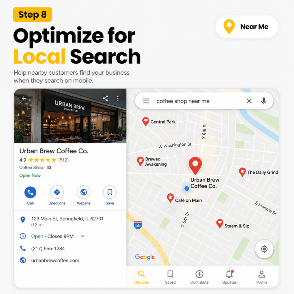
8- Optimize for Local Mobile Searches
This is a huge opportunity, because most “near me” and “open now” searches happen on phones with the intent to buy. Strong local SEO turns nearby searchers into walk-ins and phone calls.
Google Business Profile Optimization
Fill out your Google Business Profile completely with accurate hours, photos, services, and categories, and keep your NAP (name, address, phone) consistent everywhere.
A complete profile is what gets you into the local map pack.
Click-to-Call Buttons
Add click-to-call buttons so a searcher can ring you with one tap, because a fast mobile site that still doesn’t ring the phone is a common reason Las Vegas businesses get traffic but no calls.
On mobile, a phone number people can actually tap turns interest into a call before they cool off.
Mobile Location Pages
Build a dedicated location page for each area you serve, with local content, directions, and embedded maps.
This helps you rank for searches in every neighborhood you cover, not just your main address.
Local Schema Markup
Add LocalBusiness schema markup so Google can connect your business to your city, services, and reviews.
A plumber we know in Las Vegas added click-to-call and full local schema, and his calls from search nearly doubled in two months.
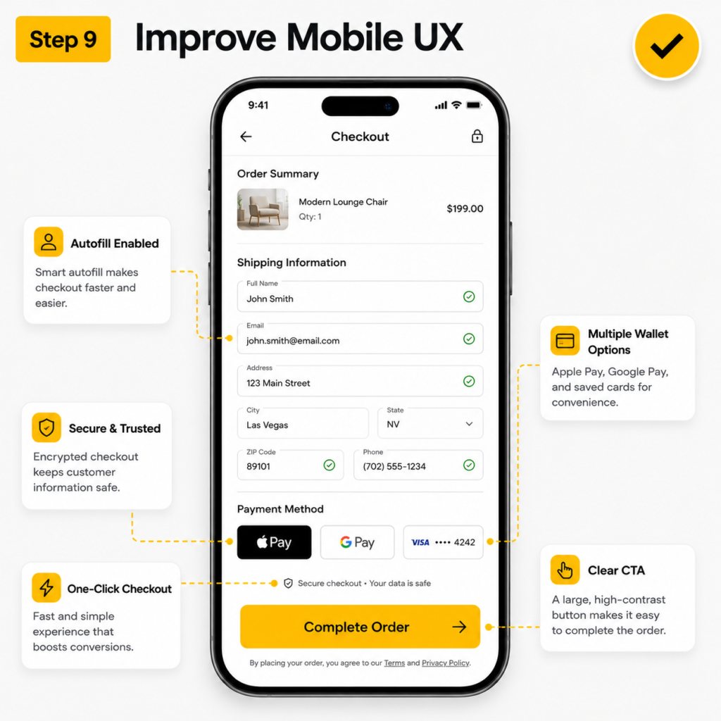
9- Improve Mobile User Experience (UX)
Make every action simple, fast, and obvious. Good mobile UX lowers your bounce rate, lifts conversions, and sends positive experience signals to Google.
Simple Navigation
Keep navigation obvious so people never feel lost. A clear path from landing to action beats a clever layout every time.
Fast Checkout or Form Submission
Shorten your checkout and your forms so people can finish on a phone in seconds. Ask only for what you need, offer autofill and mobile wallets, and cut every extra step. A shorter form is one of the easiest conversion wins there is.
Reduce Friction on Mobile
Remove friction wherever you find it, like forcing account creation, asking for details you do not need, or hiding the price. Every needless tap costs you a customer.
Improve Accessibility
Add good color contrast, clear labels, and proper alt text. Accessibility helps every visitor, supports screen readers, and lines up with the usability signals Google rewards.
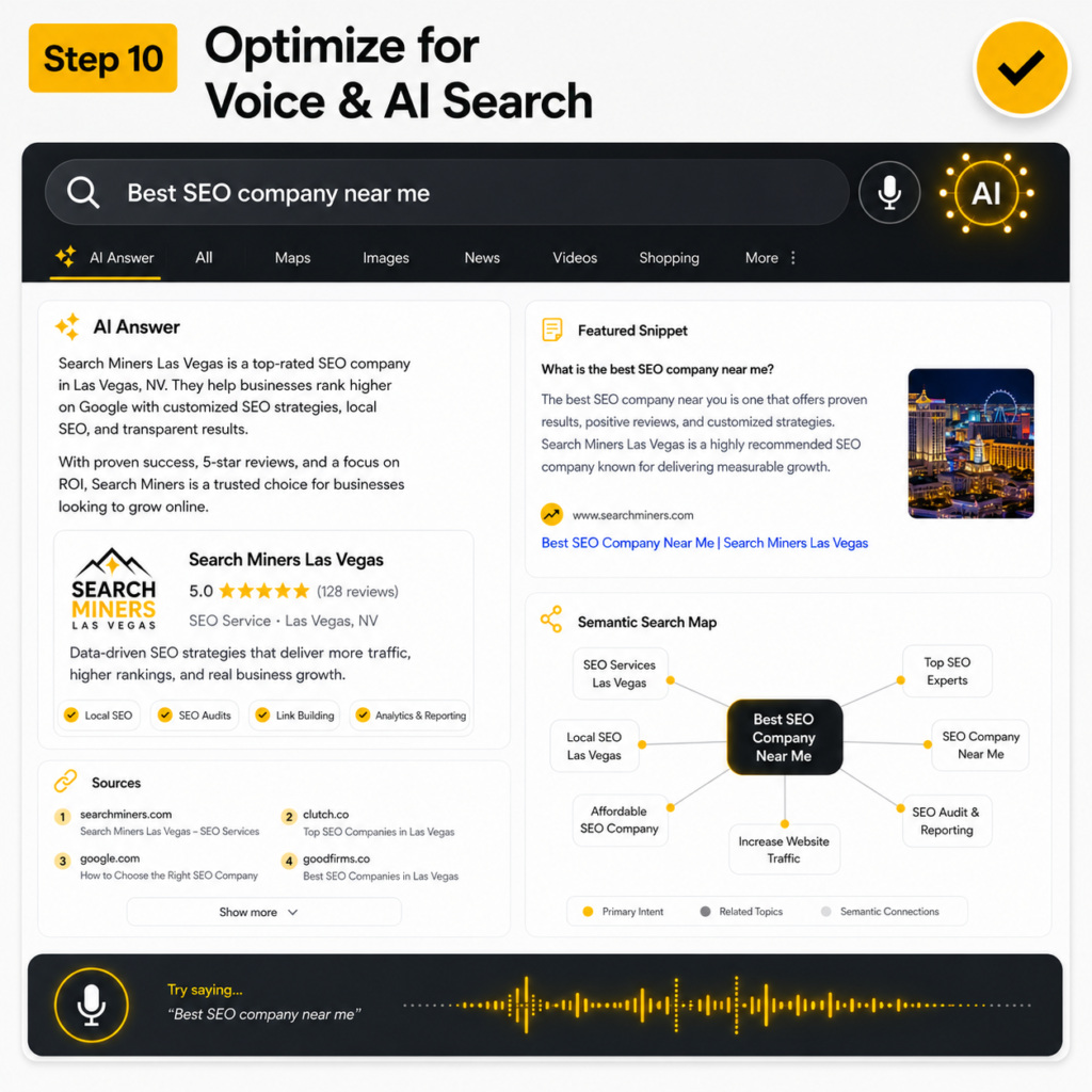
10- Optimize for Voice Search and AI Search
Most competitors still ignore this, so it is your edge.
Phones drive voice search and AI-driven answers, and a growing share of mobile queries now end in an AI Overview rather than a list of blue links.
This is where GEO (generative engine optimization) and semantic SEO pay off.
Conversational Search Queries
Write for the full, natural questions people speak out loud, like “where can I get a same-day oil change near me,” not just short typed keywords.
Long-tail, conversational phrases match how voice search actually works.
Featured Snippet Optimization
Put a clear, direct answer in the first two sentences under each heading, then expand.
That clean answer is what Google lifts into a featured snippet and what voice assistants read aloud.
AI Overview Visibility
Structure your content with clear questions, plain answers, and supporting facts so AI search engines can quote you in their summaries.
Pages that answer one question well, with real sources, show up more often in AI Overviews.
Natural Language Content
Write the way a helpful person talks, with simple words and real meaning, because that is what AI search and voice assistants pull from.
Stuffing keywords no longer works. Covering a topic fully and naturally does.
How to Test Your Mobile SEO Performance?
A few free tools tell you exactly where your mobile site stands. Run these and fix what they flag:
- Google PageSpeed Insights checks your mobile speed and Core Web Vitals with clear, prioritized fixes.
- Google Search Console reports crawl issues and how your pages perform in real mobile search.
- Lighthouse (built into Chrome) runs a full audit of speed, accessibility, and SEO.
- Core Web Vitals report (in Search Console) shows your real LCP, INP, and CLS scores from actual visitors.
- Your own phone. Open the site and tap around. This catches problems no tool will.
Need Help Improving Mobile SEO Performance?
We are Search Miners, a Las Vegas SEO company that helps businesses rank across Google, AI search tools, and social platforms.
Our specialists handle mobile SEO, Core Web Vitals, technical optimization, and AI search visibility using modern SEO and GEO strategies built for long-term growth and better search performance across all devices.
Book an SEO Audit and find out exactly what is holding your mobile rankings back.
Rank Higher in Las Vegas Search Results
Get exclusive SEO insights, digital marketing strategies, and growth tips delivered straight to your inbox. Join business owners who are already using our expert advice to attract more customers and grow their revenue.
People Also Ask
Why is mobile SEO important?
Google uses your mobile version to decide your rankings, and more than half of web traffic now comes from phones. A strong mobile site brings in more customers. A weak one quietly loses them.
What is mobile-first indexing?
Mobile-first indexing means Google looks at the phone version of your site to crawl, index, and rank it. If your mobile pages are slow or missing content, your rankings suffer everywhere. So your mobile site must be your best version.
How do I optimize my website for mobile SEO?
Start with responsive design, fast loading, and readable content. Then fix your Core Web Vitals, clean up technical SEO, and prepare for voice and AI search. Test everything on a real phone and in Google PageSpeed Insights.
How can I improve mobile page speed?
Compress your images, remove unused JavaScript, turn on browser caching, and use fast hosting with a CDN. Lazy load images so they appear as people scroll. These steps usually deliver the biggest speed gains.
Does mobile SEO affect rankings?
Yes. Google ranks your site based on its mobile version and on real user experience signals. A fast, easy mobile site lifts your rankings, while a slow, clumsy one drags them down.
About Patrick Michaels
Patrick Michaels
Patrick brings 10+ years of SEO expertise and 15+ years of professional writing experience to the Search Miners team. He specializes in creating clear, actionable content strategies that drive real business growth.